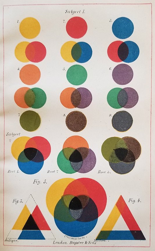
In 1845, author Charles Hayter published the sixth edition of his popular artist’s manual An Introduction to Perspective, Practical Geometry, Drawing and Painting . Hayter, a noted portrait painter and drawing master to King George IV’s daughter Princess Charlotte, issued it several times beginning in 1813 until his death 22 years later. Lessons took the form of charming dialogues between his four children, two of whom followed in his artistic footsteps. Engravings of instruments and geometrical diagrams helped to illustrate Hayter’s instructions; however, something was missing that prompted the author’s son John to prepare new drawings for this posthumous edition. Trying to convey the “relative balance” and the “full extent of the powers” of the three “primitive,” or primary, colors and their six principal descendants in black and white was no longer sufficient. To fully realize his father’s theories on color combinations, warm and cool tints, effects of shading, and the composition of light, Hayter turned to the man whose developments in printing technology revolutionized the world of color.
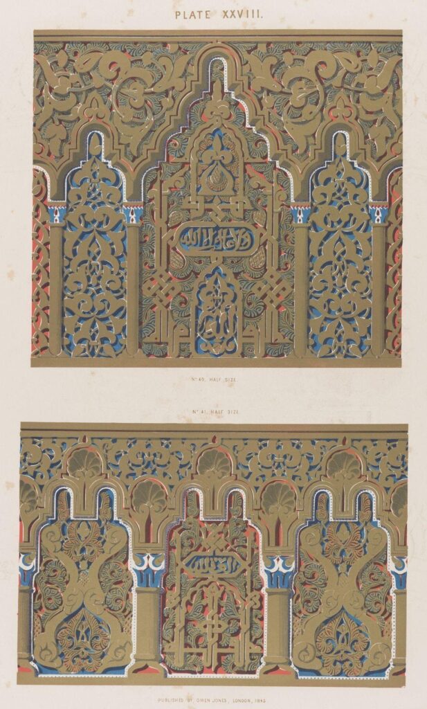
Owen Jones, architect, designer, and theorist, was the man of the hour, and it was no wonder that he was hired to produce five lithographed plates for the manual. The year 1845 also saw the completion of Jones’s first work, Plans, Elevations, Sections and Details of the Alhambra, issued in 12 parts over several years, the first major one to capitalize on the new process of chromolithography. Jones, while on his Grand Tour, observed firsthand the architectural application of color theory in the reliance on primary colors in ancient buildings. He became entranced by the Nasrid palace’s Islamic decoration while in Spain and undertook a detailed study of its architectural fragments, ornaments, and motifs through drawings, measurements, and casts. When Jones was ready to publish his findings to share with other designers, he faced an obstacle with accurately representing the lush polychromatic schemes. However, the moment was right for Jones with the advent of chromolithography. Lithography had been in use since the late 1790s, yet plates were still hand-colored for decades until more experimentation occurred in the 1830s. Chromolithography was a painstakingly laborious process requiring much precision to register, or correctly align, an image on paper from a series of stones, one for each color. After many unsatisfying attempts, Jones set up his own presses to achieve the desired results employing seven colors, or stones, for the Alhambra images.
Armed with new-found expertise and a financial need after suffering losses with the Alhambra printing, Jones fulfilled orders from publishers for color plates that ended up in the hands of not only art students and designers, but also the burgeoning middle class. These products ranged from menus to playing cards to scrap albums, with one very profitable line being gift books, both secular and religious, highlighted with designs echoing medieval illuminated manuscripts. Although Jones’s name was not always evident in these publications, his design aesthetics were being shared with a new and broader audience.
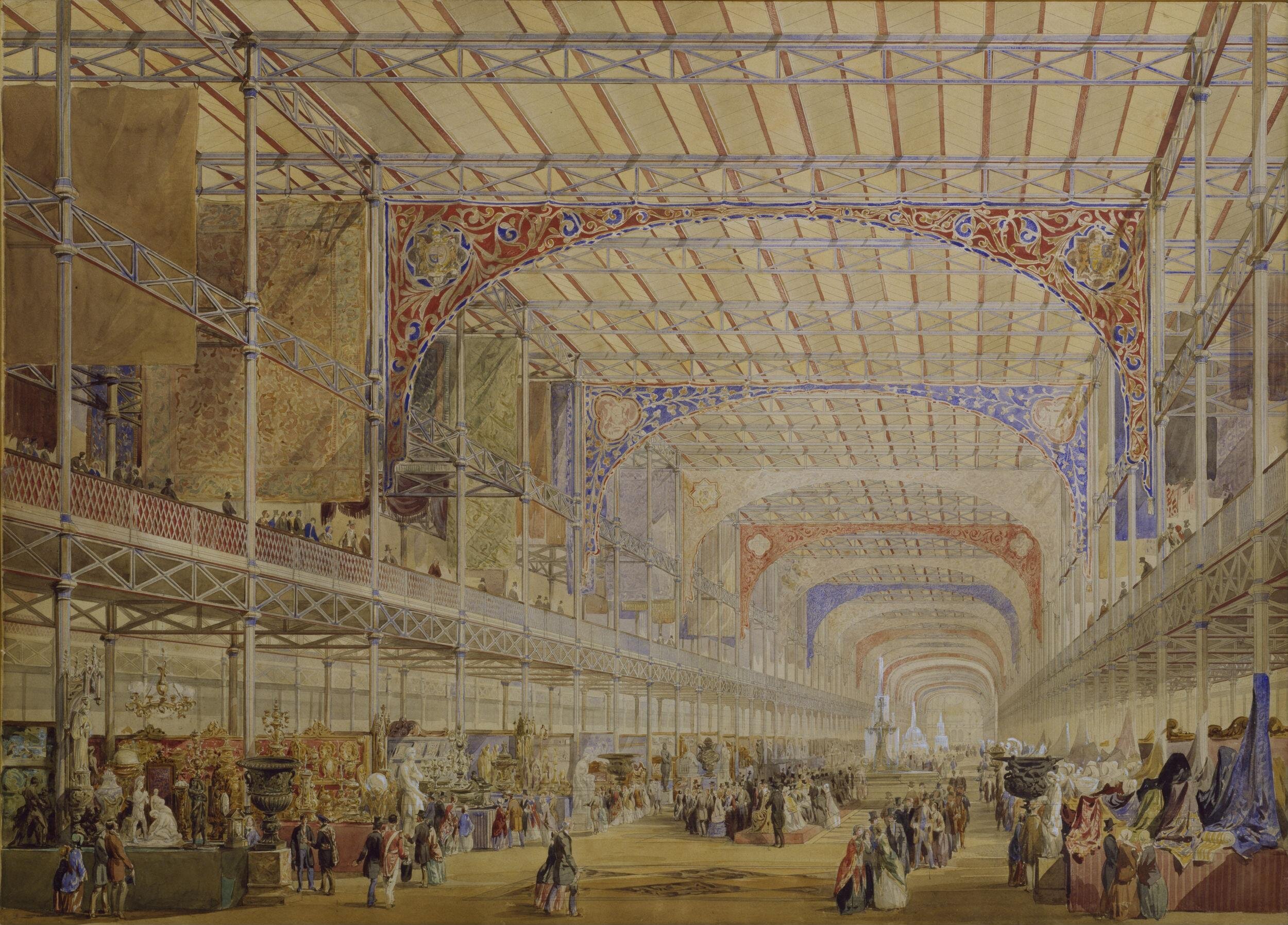
Jones’s stature increased with his appointment as Superintendent of Works for the 1851 Great Exhibition with responsibilities for the interior decoration and exhibit arrangement in the Crystal Palace. Jones devised a radically simple scheme of using red on horizontal, yellow on projecting convex, and blue on receding concave surfaces based on his Alhambra studies. Once the colors’ intensities were toned down to appear more pleasing in the massive space, the cohesive result was much praised by critics and experienced by six million visitors. After the fair closed, Jones continued to disseminate his theories on decoration and polychromy in lectures to art and design students.
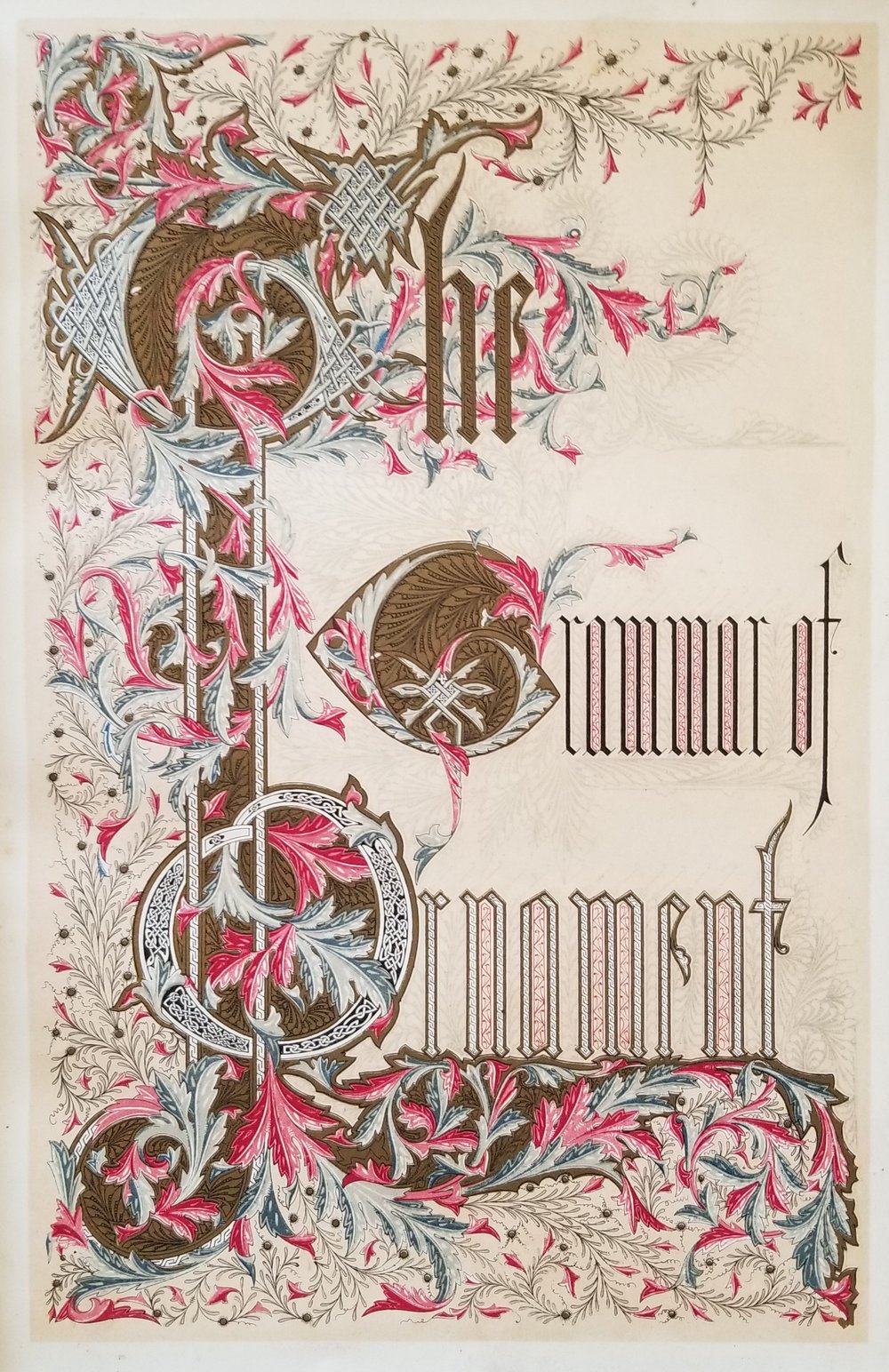
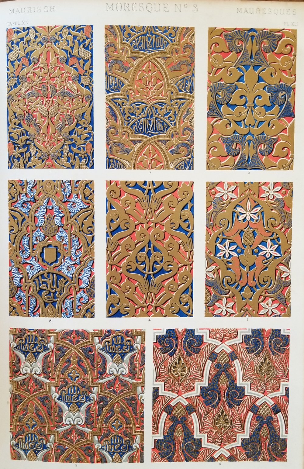
Two decades of work in design, practice, and printing culminated in the 1856 publication of The Grammar of Ornament, Jones’s most enduring legacy still in print today. Jones’s book, a copy of which is in the Stephen L. Wolf collection on applied and theoretical color at Historic Deerfield’s Memorial Libraries, provided designs from ancient and medieval sources to educate his audience and further encourage the discovery of a new, modern style. To this end, his use of both flat patterning and geometry was crucial, yet the vivid polychromy with up to 20 colors in the 112 plates took center stage. Of the 37 “General Principles in the Arrangement of Form and Color in Architecture and the Decorative Arts” stated in the introduction, over half focus on color with explanations of the importance of primary colors, color harmony and balance, and surface placement. The 11 years spanning the completion of the Alhambra plates and The Grammar of Ornament witnessed a technological leap that facilitated more rapid and affordable production, leading to greatly increased circulation. Not only did Jones influence the next generation of designers such as Christopher Dresser and William Morris, his advances in chromolithography initiated a printing explosion in the second half of the 19th century that forever transformed how the world experienced color.
